As America grows numb to the ongoing overdose crisis, RehabAid has an idea for keeping people engaged
By Jason Langendorf
The recent surge in drug overdoses in the United States has become front-page news and top-of-telecast fodder on almost a daily basis.
And that’s a problem—for a number of reasons.
The invoking of such stark statistics can open eyes. But over time, numbers can also numb. The data that forms our understanding of overdose trends can cut both ways, initially resonating but perhaps losing shape and context as the epidemic becomes entrenched. It’s impossible to overlook roughly a million deaths since 1999, but the drumbeat of overdose lethality may have a terrible side effect: normalizing our collective helplessness.
That’s why RehabAid is engaging the public and working to re-open eyes using a slightly different approach, according to Jenn Tomomitsu, Ph.D., a writer for the group of addiction researchers and advocates,
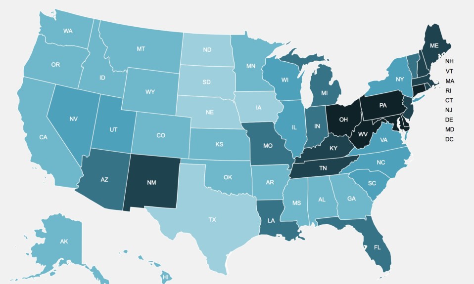
On the RehabAid website, an interactive map of drug overdoses in the U.S. offers not only state-by-state data and more granular information on the issue, but also comparative features and a timeline that make for a compelling visual highlighting how and where the overdose epidemic has taken hold across the country over the past two decades.

“That’s kind of why we made it—to make the information easier, more accessible,” says Tomomitsu. “And also to paint a different picture than just the generic stuff that’s out there all the time.”
The Grim Inspiration for the Interactive OD Map
Every month since June 2019, according to the Centers for Disease Control and Prevention (CDC), has seen an increase in the number of reported overdose deaths in the U.S. over the previous 12 months. That figure reached 95,133 in February 2021 (the CDC’s most updated data), amounting to a 29.7% year-over-year spike.
Those numbers don’t lie, but their power to wow us can wane. RehabAid’s interactive OD map, on the other hand, displays the scope and depth of the problem in a manner that would ring true for anyone who has seen the chilling time-lapse spread of a virus creep across a digital map in a Hollywood thriller. The current map draws from data through 2019, so the visual impact will only get more stark as the numbers update.
Tomomitsu says the interactive OD map is “one of the first steppingstones” for RehabAid, which plans to continue developing more addiction and treatment resources.
“I think there’s a lot of misunderstanding out there about addiction,” Tomomitsu says. “In that sense, it’s useful to provide more detailed information to people, rather than just, ‘Oh, overdose deaths are increasing.’ Because what’s out there in the mainstream media can be quite sensationalized.”
Photo: Glenn Cartsents-Peters